If you’ve ever watched “Extreme Makeover Home Edition” on television you know that most of the homes they renovate or rebuild are for families with children. And most of the children end up with “theme rooms” based on questions from the crew of designers. For instance, if a child loves outer space, then he ends up with a bed that looks like a space capsule. A little over the top for sure, but it points out the importance of choosing “one thing” around which to build a room. You probably won’t be choosing “space” for your space, but certainly you can decide on something upon which to build.
Find something, anything, that reflects the chore characteristics of the “room to be.” Obviously, if you’re decorating a library, you might start with a desk. But you might also start with your library of books… line them up and study the colors as they blend together book after book. Maybe you have a favorite pillow, or an old coffee table. Once you find that one thing. Study it. Really study it for all it’s subtleties. Let it tell you how to decorate the rest of the room.
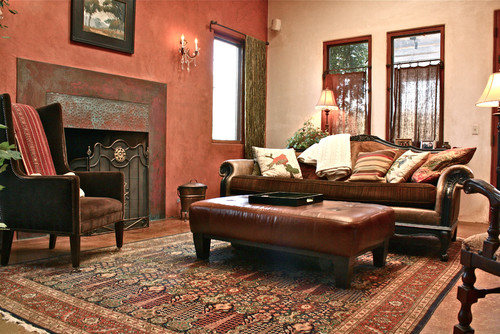
I recently helped a friend decorate a media room. He was at a loss. Should he go dark… light, bold, bright? He didn’t just want the room for watching movies he also wanted it to be a great place to hang out. He’d been spending months just looking at sofas unable to choose a color. My friend is also a collector of movie posters. He’s planning on hanging some of those posters in the media room. I asked him to choose his favorite poster, and he chose a vintage “Gone With The Wind” poster that was a cherished gift from his father-in-law. I asked him what he liked about the poster. He liked the movie he said. But he also liked the colors… the way they blended together. “It’s got energy,” he said. Of course, he’s right. The entire background of reds and oranges is Atlanta in flames. But if you look at how Gable and Leigh stand out… the reds and whites in her dress and the greenish whites in his shirt, you end up with a pretty neat combination of colors. I suggested he concentrate on the colors worn by the two actors first. Suddenly a light went on in my friend’s eyes. Now he’s out shopping for couches and chairs and he’s decided on a wall color. I can’t wait to see what he comes up with.