Red is a color that has the ability to convey complex emotions, including feelings of vibrancy and warmth. When it comes to using red in home decor, we can turn to nature colors for inspiration.
In the fall, leaves on trees begin to turn red. Generally, this is a warm shade of red with a touch of orange undertones. These red leaves look most stunning against overcast skies that are grayish blue in color. We can pair these two contrasting colors — orange-red and blue-gray — together in home decor to create a vivid, yet warming atmosphere.
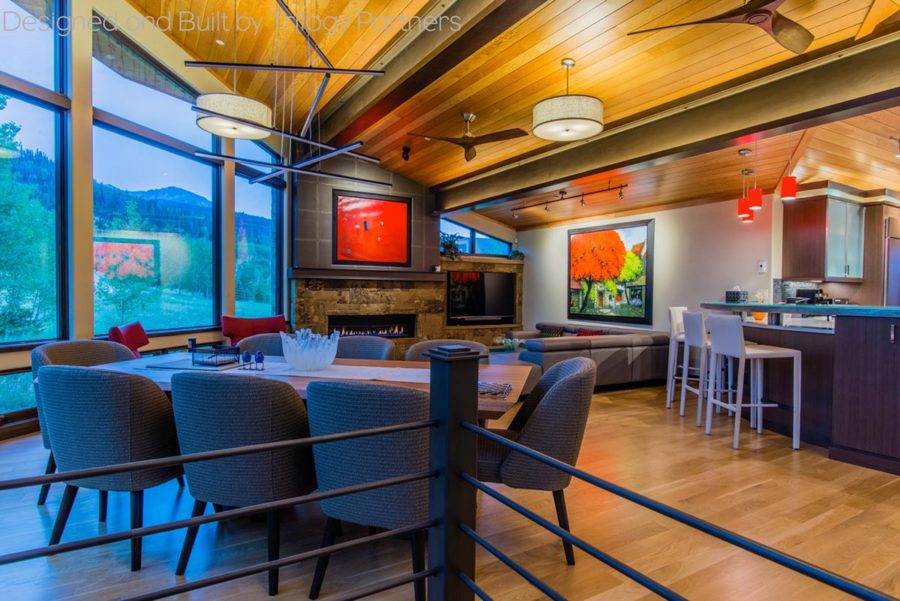
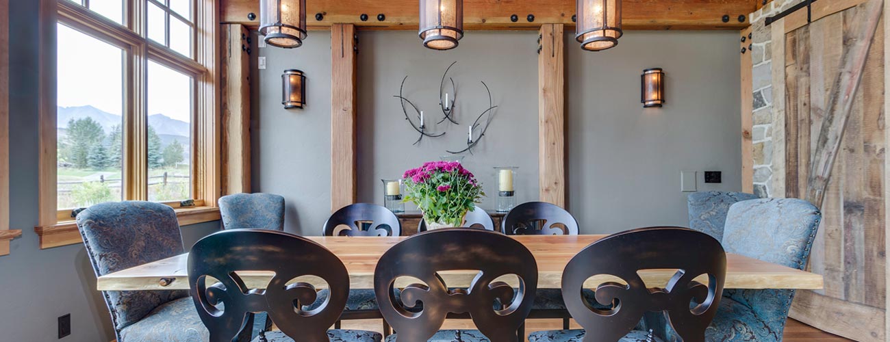
Artwork selected in Vietnam by the homeowner brings vibrant colors into the design.
Throughout spring and summer, red appears in nature as the color of flowers. From roses to petunias, red blooms tend to be brighter shades. They convey a sense of youth and creativity, especially when enjoyed next to other bright shades such as the bright green of fresh grass. In the same way, pairing bright shades of red with fresh, grass green and even the bright blue of a summer sky creates a home design that awakens the mind.
When it comes to using red in the home, Trilogy designers love replicating color combinations as seen in nature. It is the perfect way to create beautiful spaces and bring the outside in.
Explore some of our projects where red was incorporated into the design:
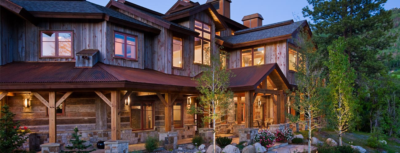
Asian Modern Fusion in Silverthorne Three Peaks