You think that look is new? I saw it in the ’80s
Predicting trends makes news. Business, fashion, design, dog breeding – you name it, and it has a trend. Trends also make you feel old if you see them come and go, and then come again. I’m sure I’ve seen what today’s prescient design pundits are predicating is new several times already. I’m confused when I pursue magazines. I don’t know whether I’m looking at home design magazines from our century or the 1950s. Been there, done that. The people buying these magazines must be born after 1985 as everyone else (who still has a memory) would think déjà vu, not new.
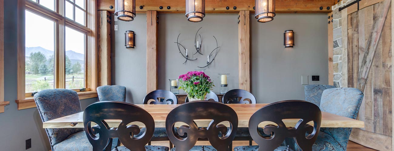
The most obvious repeating interior design trend is a traditional look enlivened with modern art or a few carefully chosen pieces of contemporary furniture. This approach appeared first in the 1960s and was associated with the decorators Billy Baldwin and Albert Hadley. What design writers neglect to point out when they write about this look and predict “a new, young take on traditional,” or whatever breathless clichés they use, is that it’s only interesting when the traditional pieces are good and the contemporary even better. Otherwise, both genres appear ungainly when together. Boring traditional, mixed with boring contemporary creates . you get the idea.
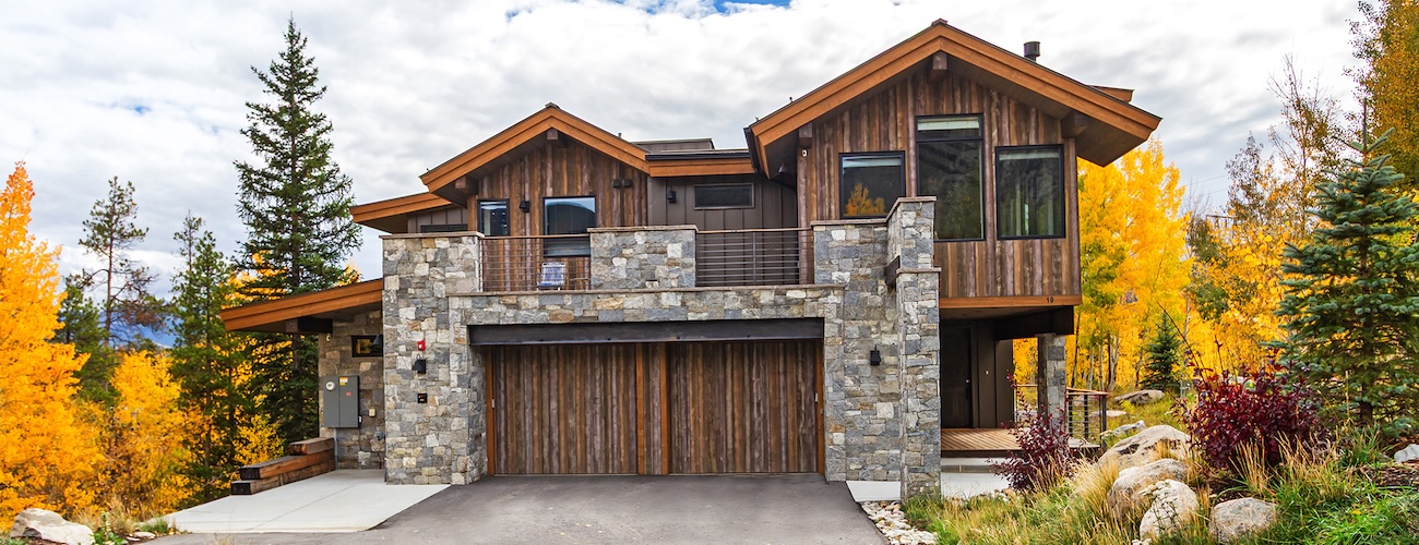
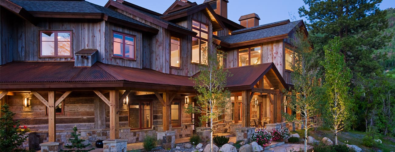
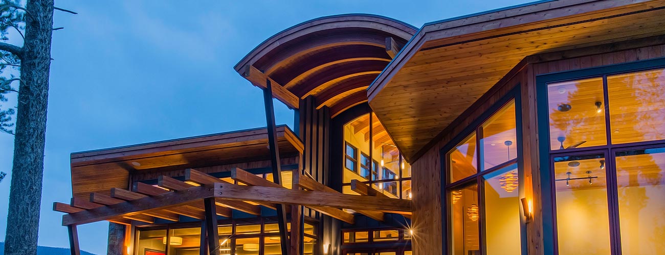
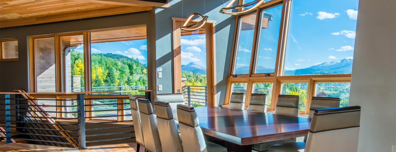
The trend of high-concept contemporary architecture surfaces once a decade. This ranges from pristine iterations of houses and condos that look like Richard Meier or Hugh Jacobson designed them, to more whimsical Frank Lloyd Wright offspring with odd angles, bright colours and lots of natural materials. You see these updated Wright clones in Aspen, and other places where people talk about being environmentalists, and build sensitive 25,000-square-foot houses that are supposed to blend into nature. I have nothing against big houses, but faux environmentalists are annoying.
The interiors of architecturally pure houses and condos are often severe. They usually feature difficult art, a.k.a. badges of superior intellect, and uncomfortable furniture. This kind of art and furniture is bought by the self-identified aesthetically fearless who see themselves akin to those who first championed the Impressionists. I’ve noticed this trend advertised with copy that speaks about “a new seriousness” and “curating your life as you decorate.” Original architecture and art should be encouraged, but the caution about the Emperor’s new clothes must always be applied.
Neutral is not a trend in 2011. It needs a rest for a few years before it can be novel again. That said, I did see a reference to it -the editor thought up the brilliant idea of featuring the “new” grey and “new” beige. It looked like the old neutrals to me, but then I recall the first tone-on-tone rooms from the 1960s. Perhaps my eyesight is failing and I’m missing a breakthrough in colour strategy.
The most pervasive trend this year is rampant eclecticism. The intensely idiosyncratic mixing of periods and odd objects can be traced back to the 1930s to decorators Rose Cummings and Tony Duquette. They had eccentric, wonderful taste, not to mention rooms with superb proportions in which to display their possessions. The current Architectural Digest cover is a perfect example of a failed attempt in this category. It’s a large, undistinguished New York apartment that I assume is fairly new. It looks expensive; this likely makes it a success for its owners. The room blends the brazenly flashy with disingenuous reproductions. It’s the kind of style design writers love because they can apply it to any agglomeration and claim it’s fabulous.
The truly enduring trend in interior design, one you never see on a magazine cover, is “desperation to be admired for the way you live.” Many are insecure about how they decorate and hence want what others want. There are very few who are trendy if, in the best possible sense of the word, they live in an original manner or have a unique, erudite perspective. When you look back on those in the past century who were this kind of trendsetter, they had ideals about how a person should live and build. The way they furnished their houses and condos was an outcome, not an end in itself. Now, it’s the other way around. People furnish a home and assume a sophisticated life comes with it. The result is they end up living in someone else’s idea of chic. Put that headline on a magazine cover.
