I don’t know if it’s just me or what but almost every design magazine I come across seems to feature the same interior designers doing approximately the same thing over and over again. Elle Décor looks like Better Home and Gardens looks like Traditional Home. Even the new Lonny Magazine seems to have fallen into the same trap. The website is very cool. But as for the contents: have we really exhausted creativity to the point that we need to publish the same basic design concepts over and over again? And why do all of these designs make the rooms look cluttered? Does every square inch of space have to have something in it? What about clean emptiness? As homes get smaller and space becomes a scarce commodity do we really want to be cluttering up each and every room with multiple layers of accessories? I think not. In the case of design, I say we go back to the idea of less is more. For once I’d like to see a room featured in an interior magazine that actually looks lived in. The worst are the staged rooms. I mean, fantasy is fine. But not at the expense of beautiful but practical design.
Some of our favorite projects
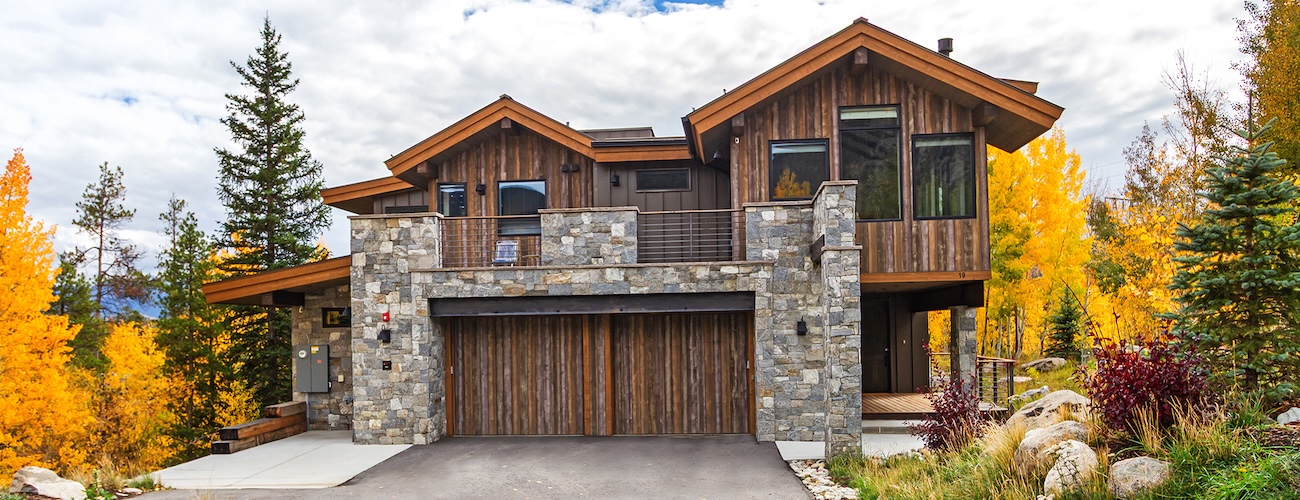
Mallard Lane
A stunning custom residence in Frisco, Colorado — where timeless mountain character meets modern design. Thoughtfully crafted by Trilogy’s design-build team, Mallard Lane reflects its alpine setting with materials, views, and subtle sophistication that elevate everyday living.
View Project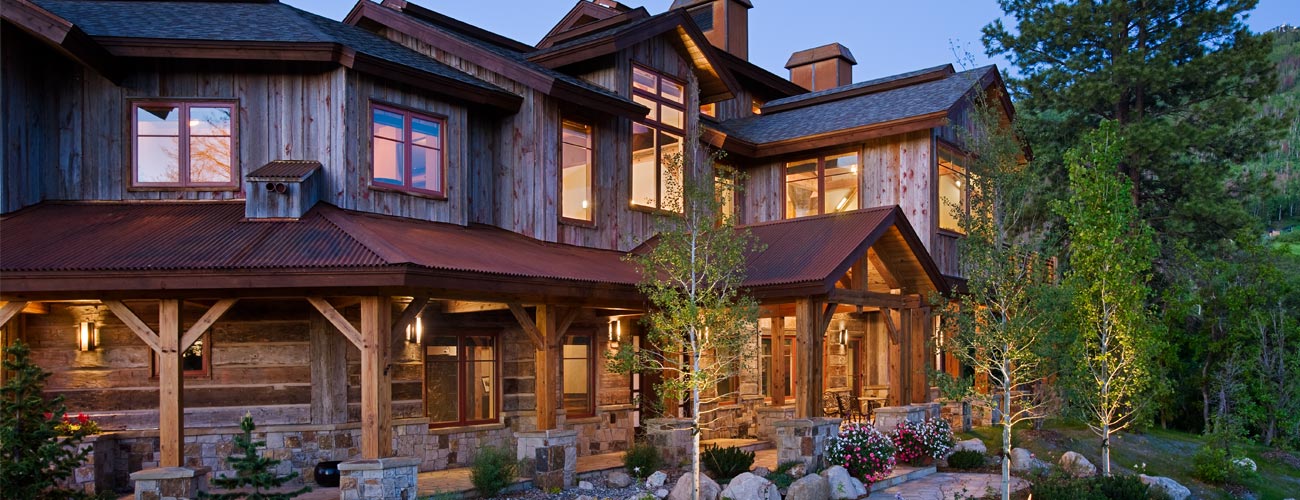
Some of our favorite projects
Storm Meadow
The Rocky Region’s best and boldest example of Western – Mountain – Asian fusion. A one-of-a-kind 6000 square foot home with a totally authentic 800 square foot Japanese Tea House surrounded by gardens and a hot springs spa.
View Project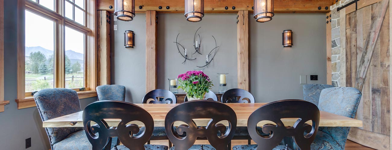
Some of our favorite projects
Tiger Road
This home was another unique collaboration between owner (an engineer with decades of construction experience) and Trilogy Partners. Trilogy was entrusted as Design Build Project Manager and retained bhh Partners for basic architectural design.
View Project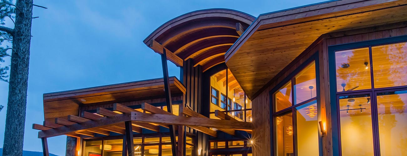
Some of our favorite projects
Three Peaks Asian Fusion
Perched in a sublime setting at the base of Three Peaks along The Raven golf course at 9000 feet in elevation, this mountain getaway was created for Denver-based clients who love the mountain lifestyle.
View Project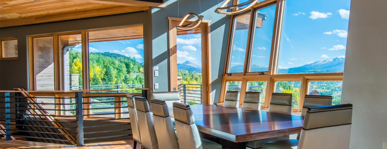
Some of our favorite projects
Hamilton Creek Mountain Modern
This modern marvel has some of the best views in all of Summit County of the 10 Mile and Gore Ranges. A multiple grand award winner at the 2016 Parade of Homes, bhh Partners served up the principal architecture.
View Project


